Data visualization types
Meaningful patterns can take many forms, such as:
-
Change: This is a trend or instance of observations that become different over time. A great way to measure change in data is through a line or column chart.
-
Clustering: A collection of data points with similar or different values. This is best represented through a distribution graph.
-
Relativity: These are observations considered in relation or in proportion to something else. You have probably seen examples of relativity data in a pie chart.
-
Ranking: This is a position in a scale of achievement or status. Data that requires ranking is best represented by a column chart.
-
Correlation: This shows a mutual relationship or connection between two or more things. A scatter plot is an excellent way to represent this type of data pattern.
Line chart
A line chart is used to track changes over short and long periods of time.
When smaller changes exist, line charts are better to use than bar graphs.
Line charts can also be used to compare changes over the same period of time for more than one group.
Column chart
Column charts use size to contrast and compare two or more values, using height or lengths to represent the specific values.
Heatmap
Similar to bar charts, heatmaps also use color to compare categories in a data set.
They are mainly used to show relationships between two variables and use a system of color-coding to represent different values.
Pie chart
The pie chart is a circular graph that is divided into segments representing proportions corresponding to the quantity it represents, especially when dealing with parts of a whole.
Scatter plot
Scatter plots show relationships between different variables.
Scatter plots are typically used for two variables for a set of data, although additional variables can be displayed.
Distribution graph
A distribution graph displays the spread of various outcomes in a dataset.
If outcomes are categorized on the x-axis by distinct numeric values (or ranges of numeric values), the distribution becomes a histogram. It's a chart that shows how often data values fall into certain ranges.
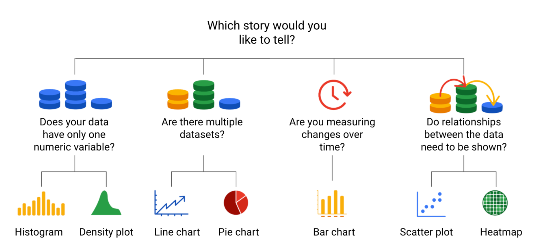
Decision trees
A decision tree is a decision-making tool that allows you, the data analyst, to make decisions based on key questions that you can ask yourself.